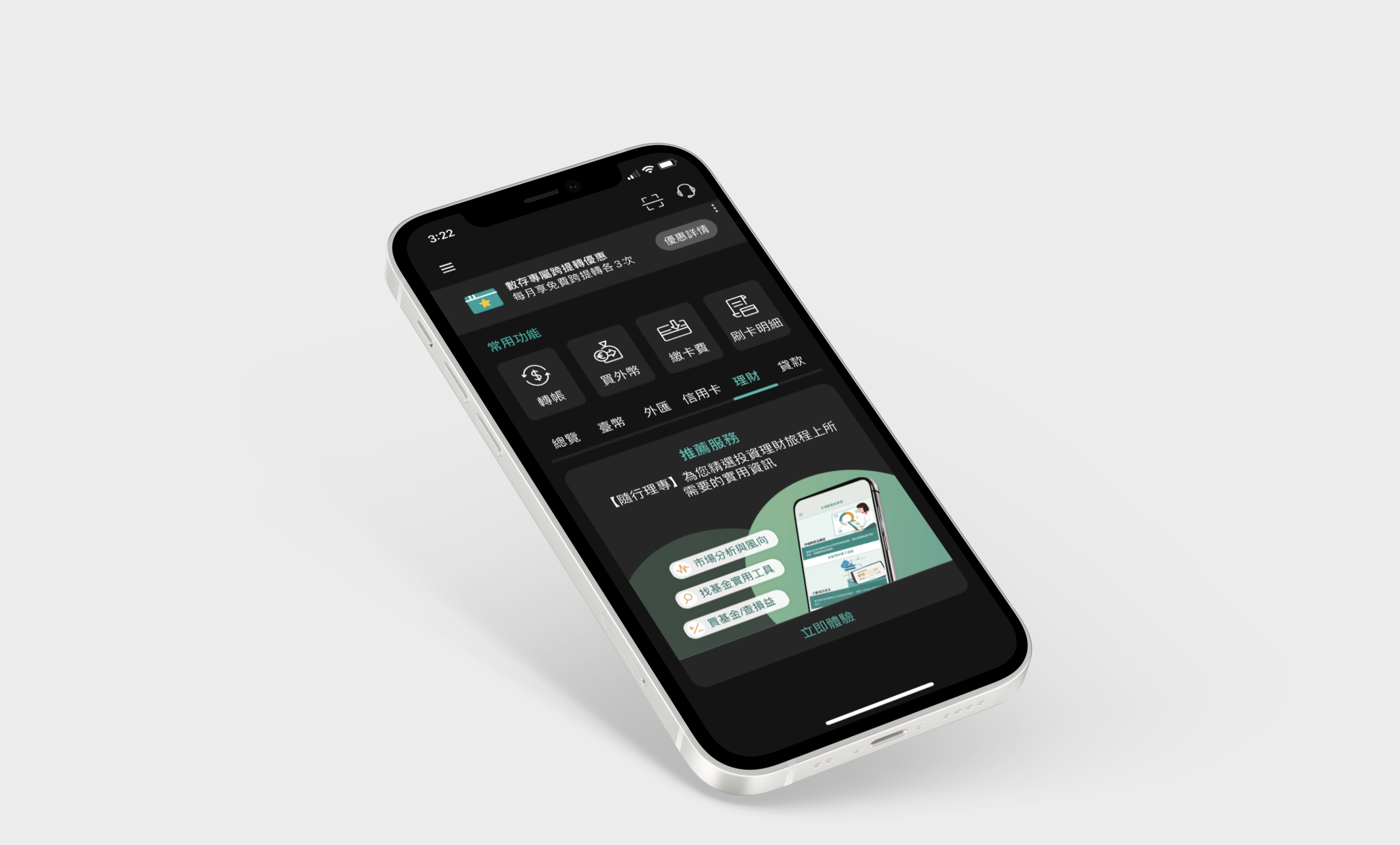
Overview
The dark mode design project is to create an alternative color scheme for the app that is optimized for low-light environments and provides a visually comfortable experience for users. The design process involves selecting a color palette, modifying the app's UI components to work well in low-light environments, and considering accessibility guidelines to ensure the app is usable by all users.
Goal
The goal of designing a dark mode app is to provide a more comfortable and visually appealing experience for users who prefer to use the app in low-light environments, such as at night or in dark rooms. By using a darker color scheme, the app can reduce eye strain and improve readability in these situations.
What we do
The first step in designing the dark mode for our app is to consider the existing color scheme of
our brand and how it can be adapted for the dark mode. Our design team analyzed various color
schemes from our design system that are suitable for low-light environments and provide adequate
contrast between the text and background elements based on the Web Content Accessibility
Guidelines (WCAG).
After careful consideration, we made adjustments to the design system to
accommodate the new color scheme. We created mockups in the dark mode version and subjected the
app to testing on various devices and in different lighting conditions. This involved modifying
the style guide, updating color variables, and reviewing components to ensure they work
effectively in both light and dark modes. By following this process, we were able to create a
seamless and cohesive dark mode experience for our users.
Outcome
The project ensure the dark mode design was consistent and provided a comfortable user experience. As a result of our efforts, we successfully launched the app's dark mode version in March 2023.
Any question or remarks? Feel free to Email me! 📧
jeanzu19@gmail.com