Official Recruitment Website Redesign Project @ E.SUN BANK

Overview

The purpose of the Recruitment Website Redesign Project is to create a visually appealing and user-friendly website that effectively communicate the company's brand and culture, and attract top talent to apply for job opportunities.

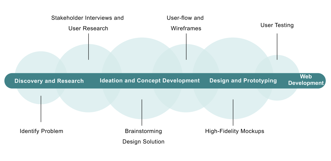
I worked on this project as a UX/UI Designer and Front-End Developer. I focused on enhancing the user experience and streamlining the application process, making it easy for candidates to learn about the company, search for job openings, and submit their applications.

Design Process
The Problem

The analysis of the old recruitment website revealed several significant issues that impacted its effectiveness and user experience:
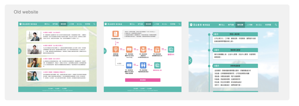
  • 70% Bounce Rates, suggesting that users were not finding the website engaging or easy to navigate, leading to a loss of potential candidates.
  • 25 % Job Application Rates, indicating to difficulties in the application process, deterring potential candidates from completing their applications.
  • Poor Visibility of Action Buttons, making it harder for users to proceed with their intended actions.
  • Outdated Design failed to convey the company’s modern and innovative brand identity.

User Research

I interviewed with the HR team and other stakeholders to gather requirements and understand pain points. The user research revealed several critical issues with the old recruitment website:
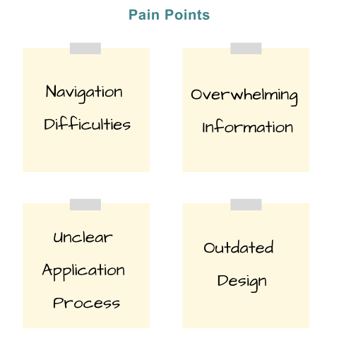
  • Navigation Difficulties: A cluttered interface that made it hard to find relevant job listings and information.
  • Overwhelming Information: The abundance of information on each page overwhelmed users, leading to confusion and frustration.
  • Unclear Application Process: The steps to apply for a job were not intuitive, causing many potential candidates to abandon the application process midway.
  • Outdated Design: The old design did not resonate with users.

Design solutions

UX Aspect:

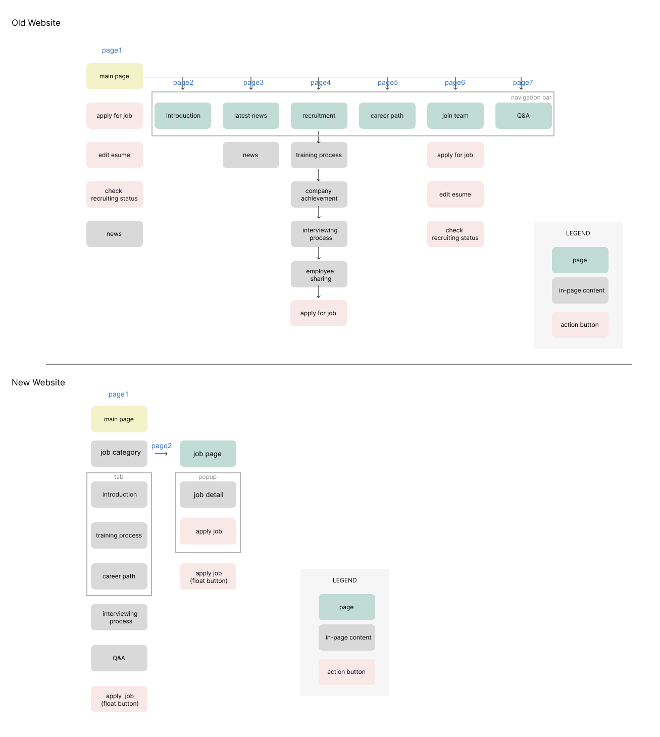
  • Simplified Navigation: Simplified the navigation menu to include only essential categories
  • Streamlined Content Hierarchy: Merged related content into a single, comprehensive page.
  • Improved User Flow: Minimized the number of steps required to apply for a job from several to
  • just three, making the process quick and straightforward.

UI Aspect:

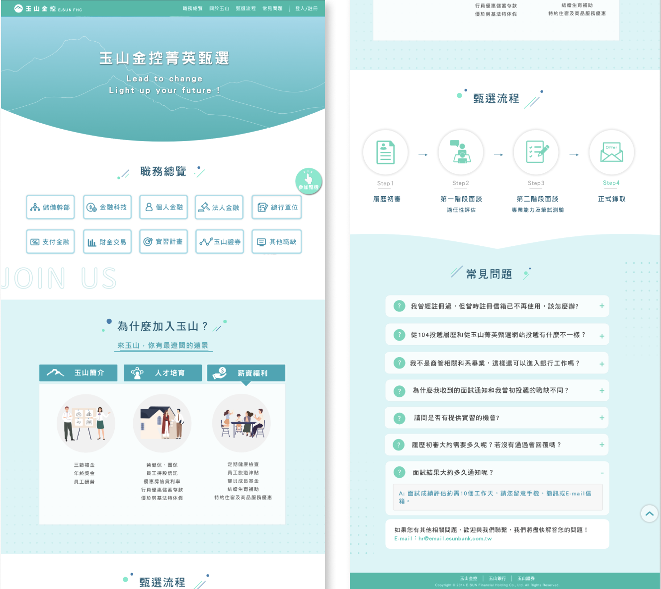
  • Modern Visual Design: Adopted a clean and tech-vibe layout that aligns with E.SUN Bank’s brand identity.
  • Consistent Branding: Incorporated E.SUN Bank’s brand colors, typography, and visual elements consistently.
  • Interactive Elements: Integrated custom illustrations, icons, and subtle animations to add a dynamic and engaging feel to the website.
  • Prominent Call-to-Action(CTA) buttons: Make it easy for users to find and interact with key functions.
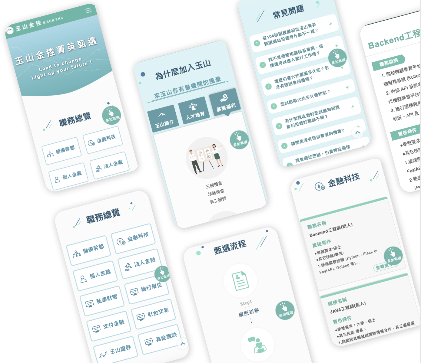
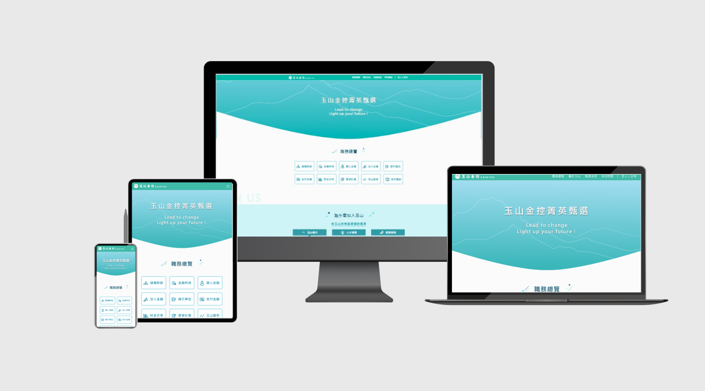
  • Responsive Design: Mobile-first approach to ensure optimal performance and usability on smartphones and tablets.
  • Visual Hierarchy: Guide users’ eyes to the most important elements first, using size, color, and spacing.

Desktop Mockup

Mobile Mockup

Development and Launch

After completing the design process, the project moved into the development phase. I built a responsive layout using modern web technologies such as HTML5, CSS3, and JavaScript to turn the finalized designs into a functional, high-performing website. This phase involved close collaboration between back-end developers to ensure the website was not only visually appealing but also technically robust and user-friendly.

Outcome

The redesigned recruitment website resulted in a 40% increase in the number of candidates applying for job openings. This significant improvement was attributed to the new website design, which made it easier for potential candidates to find job opportunities and apply for them. The project successfully delivered a high-performing, visually appealing, and user-friendly recruitment platform that meets the needs of both the company and its potential candidates.

See recruitment website

CONTACT

Any question or remarks? Feel free to Email me! 📧

jeanzu19@gmail.com